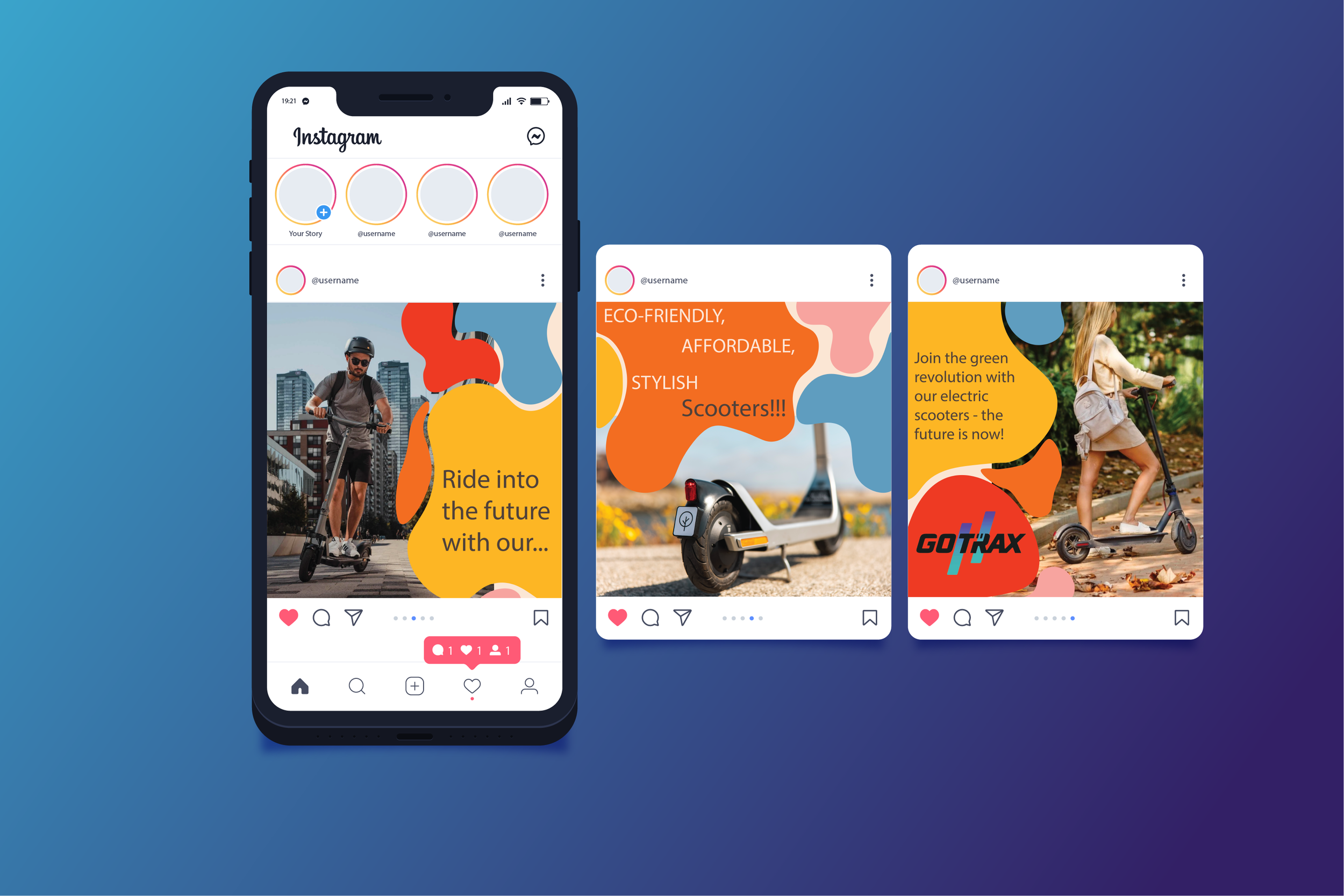
E-scooter adProcessThe use of images that in the same age range of the audience for the ad was important because it allows for the audiences to put themself in the shoes of a person who owns a E-scooter.
Color palette
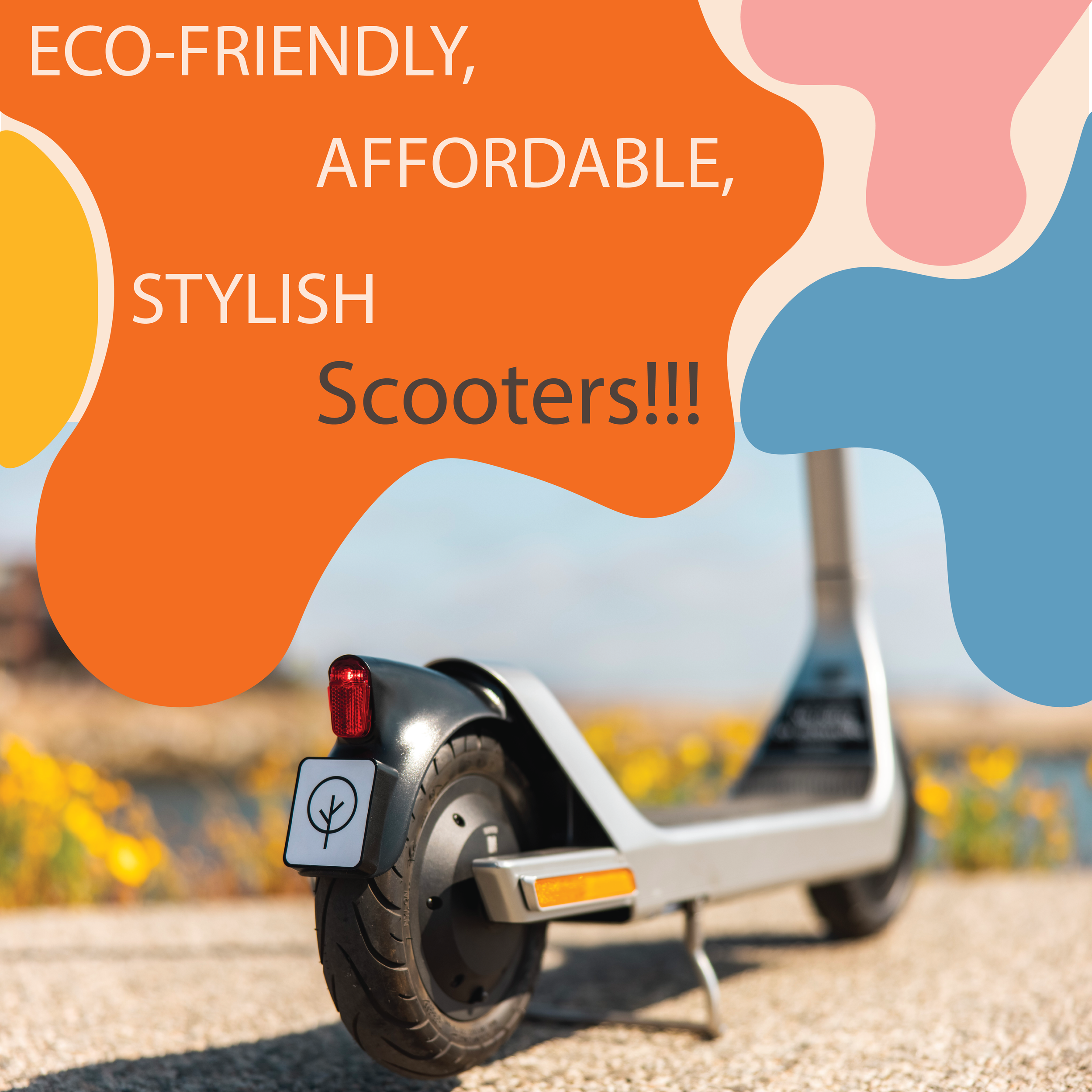
The use of bright colors and crazy shapes is to connect back into the idea that this ad is for college students. When I was a college student I was very attracted to bright colorful color. I also wanted to overall ad to be playful and fun for the audience.
Having a playful and fun color palette was very important for the layout of the slides but the font is also very important as well. I wanted my typeface for this ad to be somewhat playful as well but also having a professional and business like under tone as well.
Class Assignment - Graphic Design 4 - Fall 2023
For this assignment we were told to choice a product and make a 3 slide Instagram Ad. I decided to pick the E-Scooter as my product and I want to direct my advertisement to college student.
Individual Slides:
Typefaces:
Roboto, Titillium


